
Tips and Tricks
|
HTML & CSS Tips and Tricks |
A BETTER BOLDFACE
Until recently, my default web-page font was Verdana, primarily because its characters and spacing are a bit wider than most, rendering it more readable than the other fonts that are guaranteed to be installed on every computer. I find, however, that boldface Verdana text tends to be a bit much, or 'over the top', as it were:
[ This boldface Verdana text is generated by the <strong> tag. ]
That is a bit too bold for my taste. Generally, the writer's
intention is simply to emphasize a word or phrase, not have it dominate
the page. For this reason I stopped using boldface at all for quite
a while, preferring underlined text instead. This is a perfect
example of the total non-functionality of the feature that is supposed
to let one adjust the level of boldness.
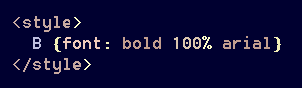
Recently, however, a solution has come to mind. Because this
problem is related to the Verdana font (and perhaps others as well),
why not use another one? Yes, that's the answer —
a style-adjustment to the <b> tag:
The result:
[ Here is some less-bold Arial text inside a Verdana sentence. ]
That's much nicer, don't you think? The slight difference in
letter-height is a worthwhile tradeoff for a better-looking page.
Unfortunately, an increase in the font size to, say, 102%, makes it overly bold
again; so I don't know of a good way to balance the letter-heights.
ADDENDUM
As of September of 2019, I have installed half a dozen additional fonts including
some of Google's online offerings. Verdana has been almost entirely replaced,
obviating the boldface issue — at least for that typeface. Perhaps
this sort of 'fix' will prove useful with one of the other new fonts, but in truth
I might never need it again.
