Tips and Tricks
 |
HTML & CSS Tips and Tricks |
HTML LINE-SPACING — A FLEXIBLE APPROACH
Suppose that this is a portion of one of your pages:
..........
..........
A paragraph of text

More text
..........
..........
Suppose also that you would like to reduce the spacing between the text and the colored bar. What would you do?
One solution would be to get out your graphic editor and reduce the height of the image, because in this case it actually looks like this:

Another solution would apply styles to several elements:
<style="margin-bottom:0">
on the first one, <style="margin-top:0">
on the third one, and <style="margin:0">
on the graphic itself. This would result in:
..........
..........
A paragraph of text

More text
..........
..........
That gets the job done; but there must be an easier way, and there is.
Similarly, you might like to increase vertical spacing for some
effect or other — say between two paragraphs.
One possibility would be to increase the top margin of the second
paragraph with an inline style. Another would be the kludgy
tactic of creating a dummy line with
<br>
.
We hit upon this topic in the article on Displaying Single
Images
. It was necessary to reduce certain margins
so that a caption could be visually close to its accompanying
image. Similarly, a pair of images, one above the other,
might appear unacceptably close together, necessitating some extra
spacing between them.
Other factors can cause one to desire minute adjustments in order to
improve the overall appearance of a page. For example, paragraphs
have built-in top and bottom margins; but many structures do
not. Having a way of accommodating these issues routinely is rather
important, if you want to get anything done. I cannot speak to the
methods of professional web-page designers, but the following
little system renders line-spacing issues almost trivial.
My suggestion is a sort of dynamic approach, meaning that one's
choice of markup is determined by what else has been displayed just
higher on a page. This keep-it-simple method utilizes
another collection of little CSS classes that enable easy adjustments
to various top-and-bottom margin settings in object-oriented
style; and it does so without using inline styles, divs, IDs, or other
folderol. The choice of atom to use is dependent only upon how
the composer wants the page to look.
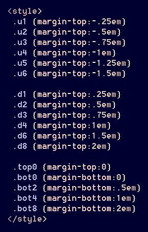
Here are some of the goodies that I find most useful. The options are graduated in ¼-em increments, which should satisfy most viewers' eyeballs:

Now, if you want to move a paragraph down a space, simply apply the desired class:

On my pages, the most frequently used spacing-classes are
[d6]
, [u3]
, [u2]
and [d8]
.
Because paragraphs have a [1em]
default margin anyway,
one usually must specify a 'greater' setting in order for it to have
an effect. On these examples, using the class [d4]
would have no impact, because it would simply redefine a margin
that already exists. In contrast to that would be a
table or an image without a caption, both of which might have no
specified bottom margin. A bit of experimenting will
reveal which class is needed for a given situation.
Note also that my naming conventions are based upon effect
rather than function. Specifying [u2]
actually
means that the text is to appear .5em
higher on the page,
which is accomplished by reducing the top margin. Similarly,
[d2]
doesn't actually 'move' a paragraph down; it simply
increases the top margin. The names [top0]
and
[bot0]
are more suggestive of their actual functions.
As before, experimentation will reveal when a particular class is needed, and why. The choice is dependent upon whether an image in the previous row was captioned, and how.
If you have an aesthetic regard for the look and feel of your presentations, then this technique can prove quite helpful.