Tips and Tricks
|
HTML & CSS Tips and Tricks |
DISPLAYING GRAPHICS THE EASY WAY
Part B — Multiple Images
There is much online gnashing of teeth over how to display multiple images
on a line. In a sensible world, such a simple and commonly desired construct
would be almost effortlessly implemented, but no — the CSS people have
elected to make a virtual nightmare of it. It's no wonder that there actually
is a groundswell movement to circumvent CSS altogether.
Pending the revolution, however, we must do what we can with available tools. A relatively new approach is to master the intricacies of the <grid> system that, despite what its pundits claim, is quite convoluted. Should you choose to tackle that methodology, then more power to you; but perhaps you would like to start a bit slower.
Another old-fashioned approach is to utilize a <float>
style; but that is difficult to control and always has seemed flaky to me.
A better solution was to use a <table> — that's right,
the stable, tried-and-true, easily manageable structure that yields
perfect results every time, yet which now is denigrated by so many.
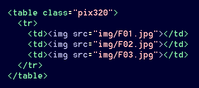
If you are one of the disparagers, please bear with me for a bit. Let's say that we would like to display three photographs on a line, evenly spaced. Using a table:
Then:
 |
 |
 |
Very nice. As on the prior page, the [alt=""] references have been left out of some illustrations just for the sake of clarity. Also in the interest of readability, I have programmed all images on this page to have a simple border; you might not want those on your own page.
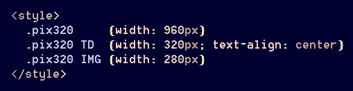
The cell and image widths can be adjusted for a different look, and captions are an option:
|
|
|
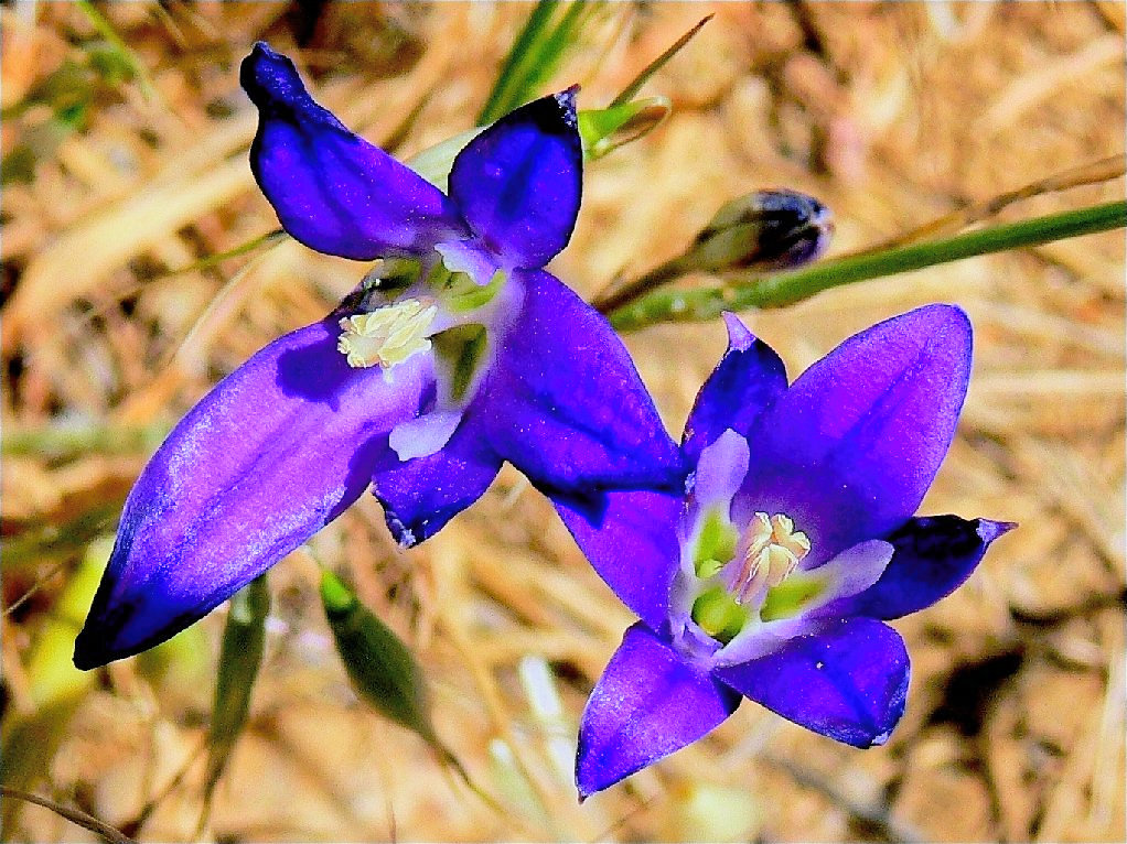
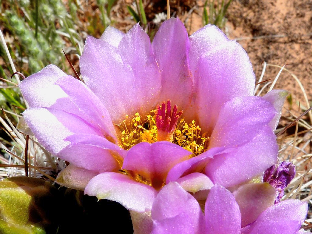
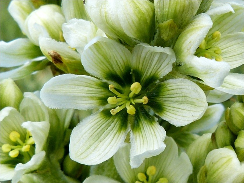
| Brodiaea | Cactus | Corn Lily |
(Note: I pre-specified that captions would be displayed in a small blue font.)
Optionally, a single caption can underscore the entire line of images:

 |
 |
 |
| Now is the time for all good men to stop and smell the flowers | ||
So what is wrong with using tables? Absolutely
nothing! In fact, they are so inherently useful that
the CSS/HTML gurus have gone out of their way to create a collection of
'fake' table functions to emulate the real ones! Hypocrites.
Most of my own pages, including this one, feature a little table
at the top — not because I am old-fashioned
or just being arbitrary, but because it's a quick and easy way
to get the job done. And that is what is important.
Perhaps, however, you are concerned that a blind person's screen-reader
might tell him that some ignorant blogger is improperly using a table for
something other than 'tabular data'. Although that person probably would
respond with, "Who gives a shit?", you are determined to do the modern thing and
display your images in another manner.
In your quest to come up with a useful solution to what should be a
trivial task of placing a couple of images side-by-side, you might
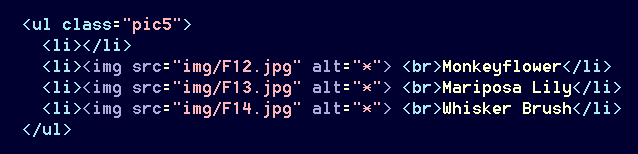
have run across the suggested usage of <ul> and
<li>, and that method can work. Using
a structure designed to generate unordered lists is absolutely not what the
Creators had in mind, but the Internet Police will not come after you for it.
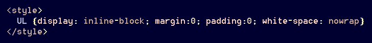
The default properties for <ul> define it as a block element with settings for margins and padding; those are amended as follows:
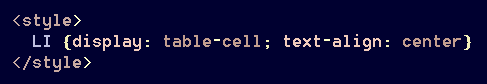
The definition for <li> must be adjusted as well,
to function like a (dare I say it?) — table cell.
This property turns out to be an incredibly useful function, which is no surprise. Because we don't want all of our unordered lists to behave strangely, though, we will assign this one to a class:
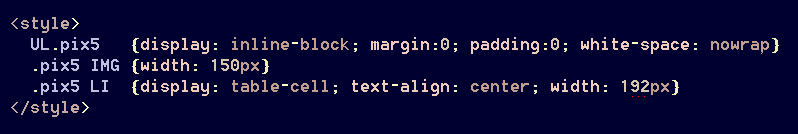
Those numbers are based upon a known page-width of 192×5,
or 960 pixels. Such layouts are flexible. The markup actually is
more concise than that for a table! This is good.


Captions are easily added here as well:
Oops! The graphics are left-hand aligned on the page, as is normal.
They would not appear centered unless the combined cell-sizes were to span the
width of the page. The <ul> structure does not support
horizontal page-centering. One kludgy solution would be to insert a dummy
cell at the beginning of the row:
But what if there were four images to be displayed instead of three? In that case, spaces would have to be inserted at both ends of the row; and depending upon the desired sizes of the images, the widths of the dummy cells might have to be adjusted as well using CSS3. There must be a better option.
One way to accomplish horizonal centering would be to wrap the code in a container
such as a <div>, and those who suffer from div-itis
might well go for that. Alternatively, of course, you could have a change
of heart and opt for the relevant structure that does support left-right
margin settings — the lowly <table>.
A top priority in my ALL.CSS file is a command that centers
tables by default.
In any case, the above method can be improved somewhat. One advantage to my proposed system is the 'proprietary' nature of the markup, which features a structure that ideally never would be used for any other purpose. This renders the setup more flexible and manageable.
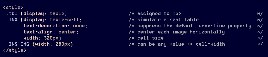
Instead of manipulating <ul> and <li> to serve
an unorthodox need, we'll do the same thing with an obscure and redundant
tag: <ins>. Although that function now is
officially allocated to the underlining of text, we already have a tag
for that: <u>. This leaves <ins>
free to be molded and contorted in a manner of our choosing.
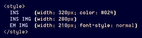
The setup for displaying images with <ins> is even simpler
than that for <ul>, because there is but one default
property. It is used in conjuction with <p>, which is
designated as a table; this is necessary to avoid page-formatting
glitches.
The markup for in-line graphic display is the same as when using
<ul>:
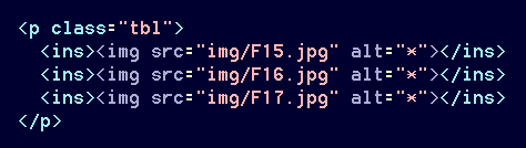
Now, it's so simple! As with <ul>, individual captions are easily added:
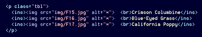
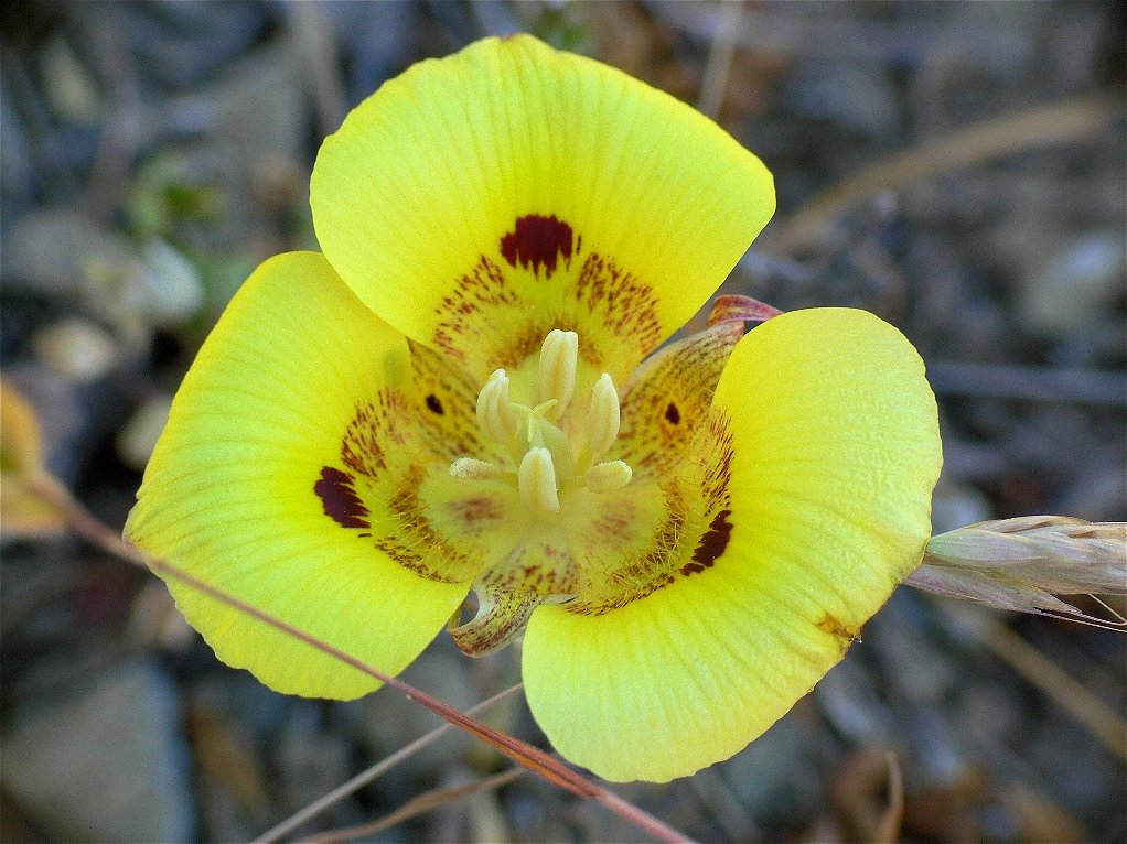
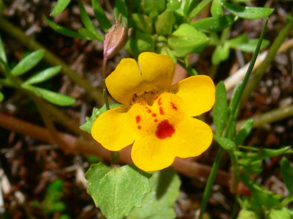
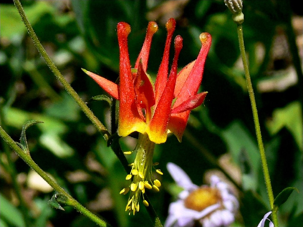
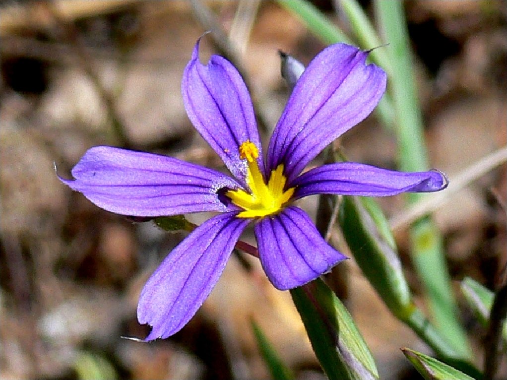
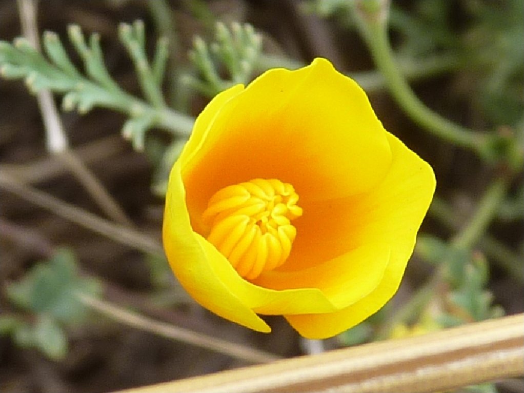
Crimson Columbine
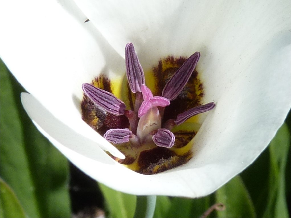
Blue-Eyed Grass
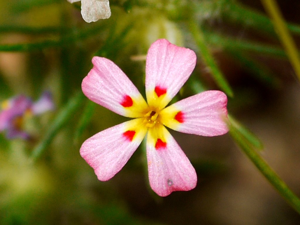
California Poppy
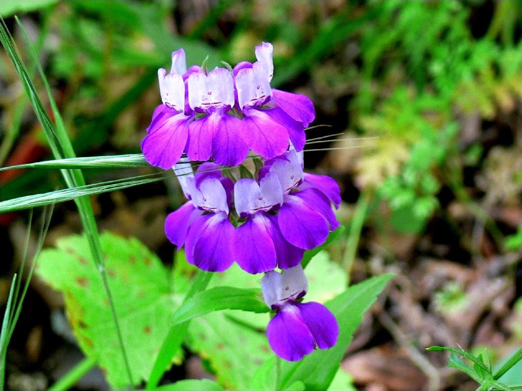
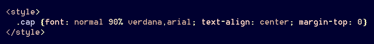
Using this method, however, an adjustment is required for a caption that spans multiple images. In order to keep the labels appropriately close to the graphics, it is necessary to strip off the top margin of the caption line:

The rain in Spain flows through a lot of flower gardens
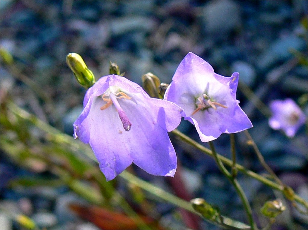
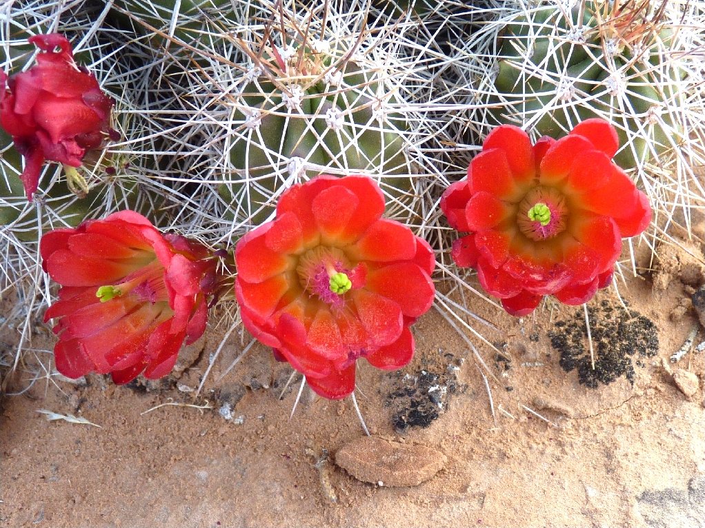
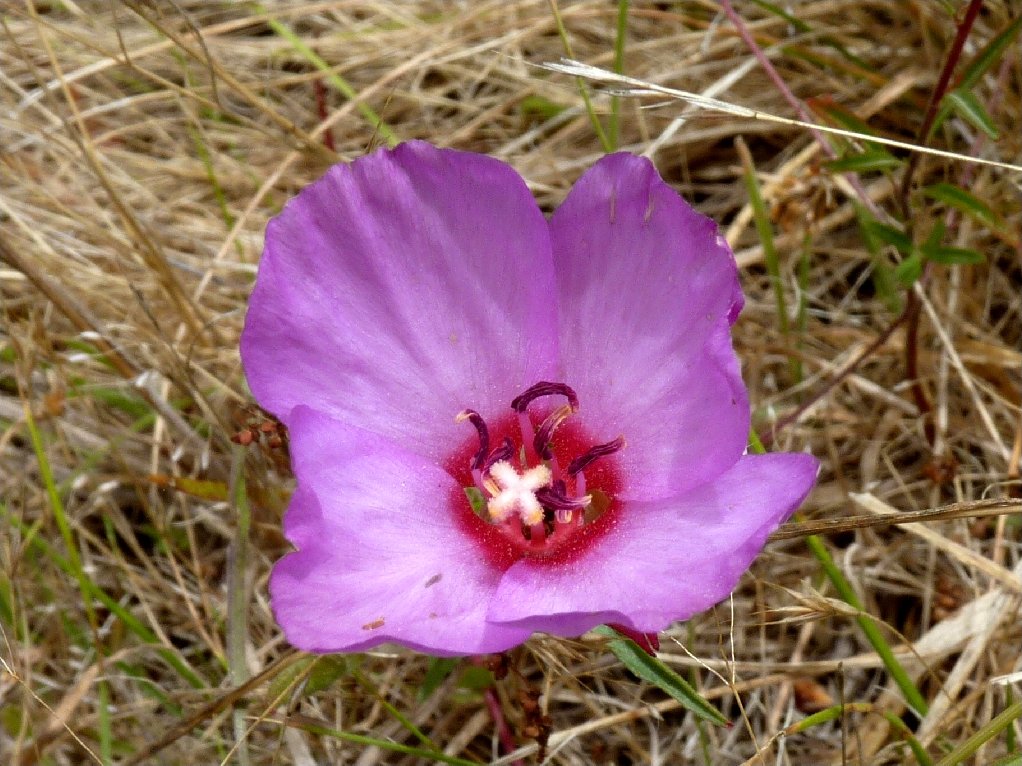
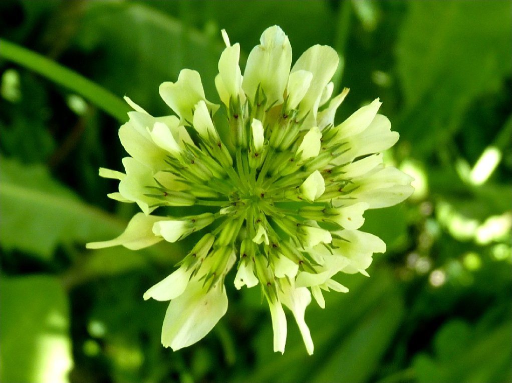
Sometimes, of course, the images to be displayed will not all
be the same size or shape. The <ins> function
doesn't care. Most of my own graphics are arranged in one of
just two widths, depending upon whether the image is in portrait or
landscape configuration. Since most are landscape-oriented,
that is the default. For a vertical image, the width is reduced
to ¾ of normal for images in a 4×3 format.
That serves to keep them approximately the same overall size on a page.
One simplistic method for accomplishing this is to wrap vertical images
in <em> tags, thereby avoiding once again the usage of
an unwanted inline style:
Voila!
Finally, there is the matter of attaching links to the images:

(click on any image to enlarge it)
Occasionally, however, it is sufficient for a single link to
reference all of the images. Using <ul>,
said reference would have to be redundantly attached to each image
as above; otherwise, the code would be invalid. With the
<ins> method, however, because of the block-level
property of <p>, a single common link can accommodate
any number of displayed images. Clicking on any one of them references
the same file; try it:
After all of that, if you would rather move up to Grids,
then I wish you well; meanwhile, I have shown how easy it is to work with
<ins>. Note that no extra container was
required at any time and, for the record, no inline styles are to be
found anywhere on this page. The occasional top-bottom
margin adjustments for a global caption are unnecessary using
<ul> and <li>, but I feel that
this is a small price to pay for the increase in overall functionality
when using <ins>.
Thus far, most discussion has been on utilizing fixed-width boxes featuring
same-size images; but of course that will not always be the case.
The following setup accommodates a couple of frequently used formats while providing
some important flexibility:
Now, one can save some coding tedium by utilizing [.tbl2] for two
like-sized images and [.tbl3] for a trio of such graphics, with all
the setup already done. That leaves [.tbl] as an all-purpose
container for less symmetrical layouts, such as those discussed in the next section.
Of course, such a setup restricts the <ins> tag from being used for
any other purpose; but that's the plan. At the time of this writing, my website
features some 18,000 graphics; so <ins> gets plenty of action.

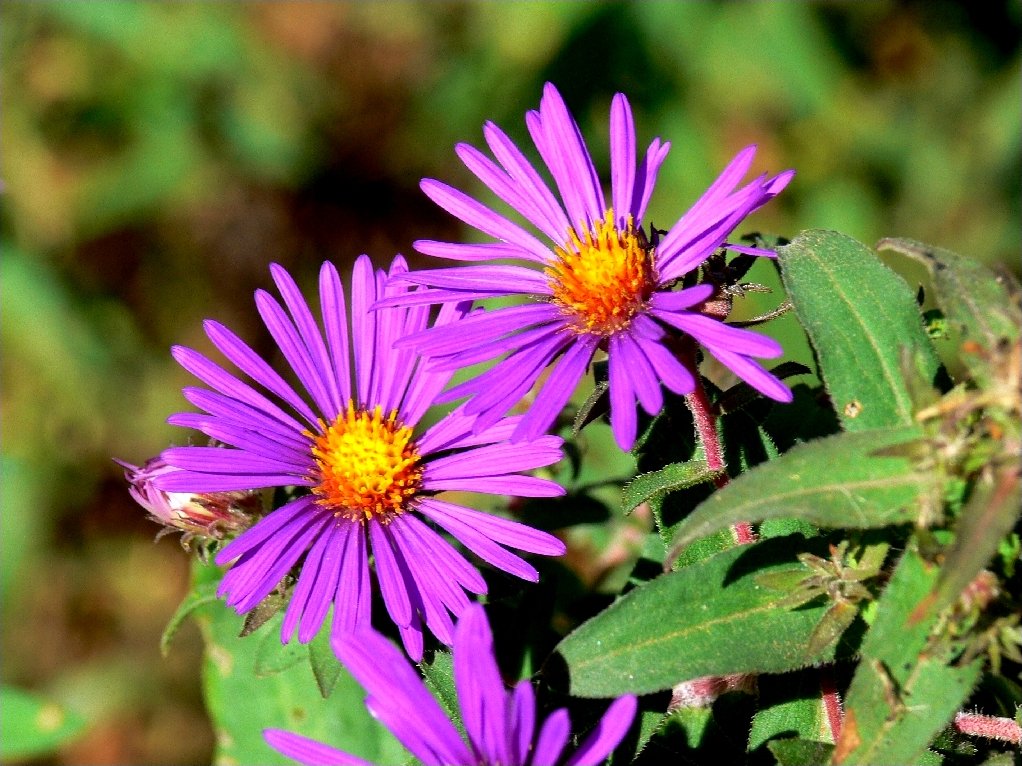
Displaying Graphics of Different Sizes
Earlier on this page was displayed a line of three flower photos, similarly sized but
of different orientations. Sometimes, though, one would prefer the line to look a
bit 'nicer', with all the graphics being the same height. Unfortunately, it seems
that one cannot simply assign new heights to the graphics via CSS. Although many
online pundits claim that the browser will adjust image widths to maintain the proper
aspect ratios, in practice that is not the case — at least, not
with all browsers.
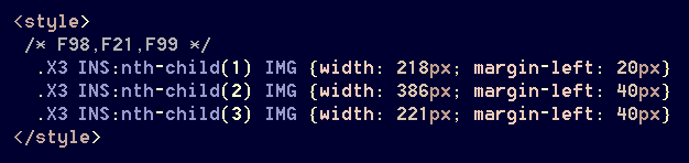
One can defeat that problem by specifying matching adjustments for both width and height, but that is unnecessary. Strangely enough, if one changes an image's width, the browser will properly adjust the height! Let's do that, starting with guesses of some new widths for the three graphics:
Okay. Those guesses weren't far off. Now, by testing various numbers and adding some spacing between the images, we can come up with this:
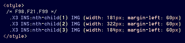
Designating image-widths in pixels is a lot easier and more accurate than resorting to fractional percentages, which might not work well anyway.
Because there is lots of spacing between the images, they can be further enlarged
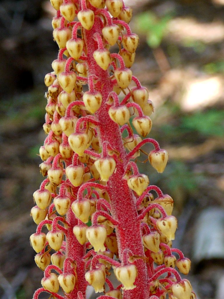
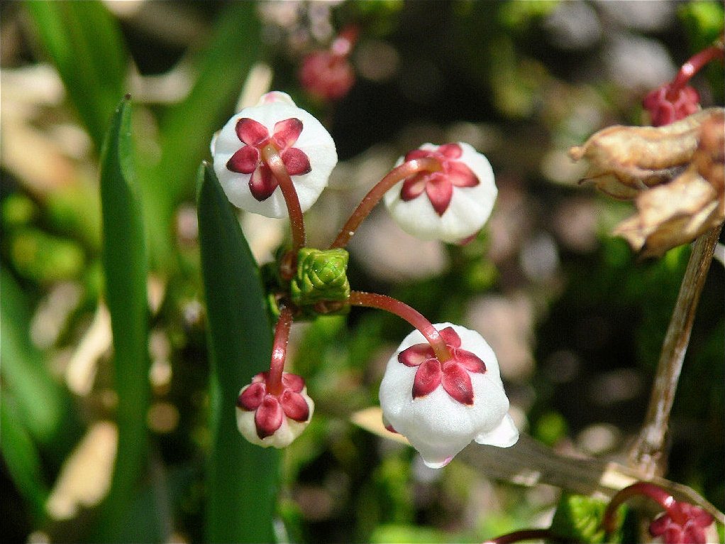
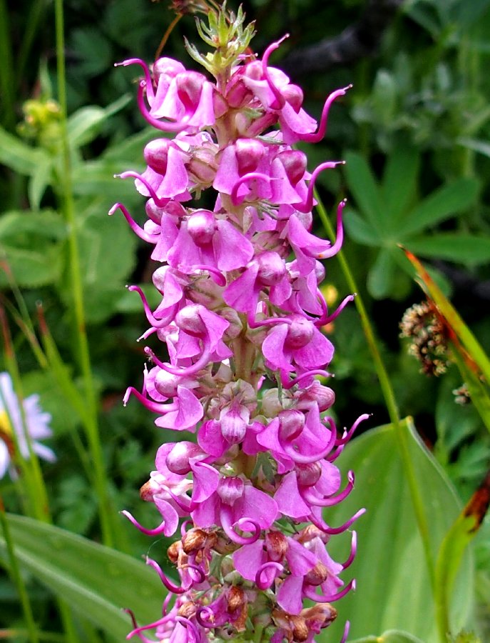
if desired. Some captions finish off a nice-looking segment:
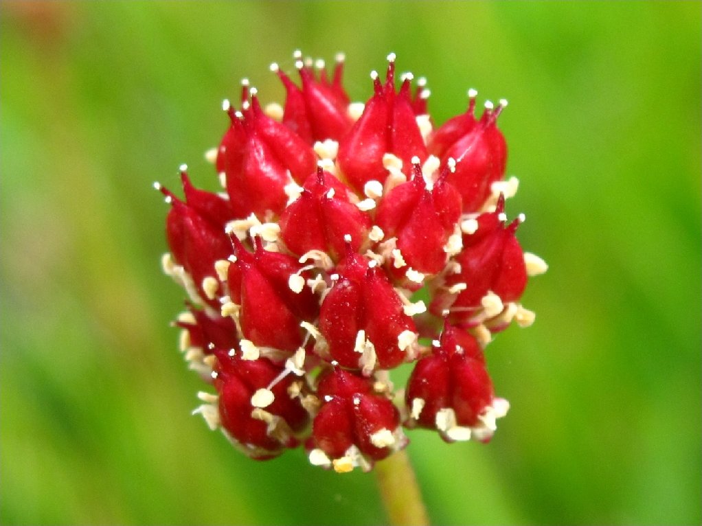
Pinedrops
White Mountain Heather
Elephant Heads
These HTML5-compliant methods are serving me well on several hundred web pages,
and without the tedium and clutter of any floats, grids,
flex boxes, divs, or inline styles.
Happy coding!
