
Tips and Tricks
|
HTML & CSS Tips and Tricks |
THE MASTER CSS FILE
Extolling the virtues of an all-purpose CSS file should not even
be necessary, because its usefulness is so obvious. I mention
the topic at all only because there are countless websites out there
that inexplicably are not utilizing such an incredibly valuable tool,
together with lower-level CSS files to handle the specific needs
of groupings of pages.
Kudos to you for already having such a file in place at the top of
your own website. I call mine ALL.CSS
for the obvious
reasons — it is connected to virtually all of my pages,
and its name is self-explanatory. Yours might be named
MASTER.CSS
, or GOD.CSS
, or some other tricky
designation; it doesn't matter, as long as you have one.
In subsequent articles I reference ALL.CSS
for making additions
and adjustments. All entries are of course just suggestions that may
or may not suit your coding style or be germain to the content of your own
pages. Just to get us started, though, this is a partial listing from
my own master stylesheet:
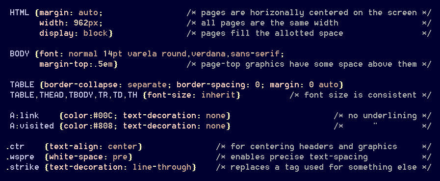
[HTML] When I began coding web pages, a
1024×768 monitor was standard; so my pages were written to
accommodate that screen resolution. The modern proliferation of
wide monitors sometimes wreaked havoc with certain pages, especially
those displaying side-by-side graphics. Rather than
re-write countless pages in an attempt to make them look better,
my solution was simply to set a maximum width for all pages.
This means that viewers with 1024px monitors don't have to scroll
around in order to see what is on a page; it's all there.
Viewers with wide screens can use [CTRL ±]
to adjust page sizes as desired. The line-wrap function
is properly enabled everywhere, so that the text-formatting
doesn't look stupid if the screen font-size is changed.
A hard-coded designation of page-width has other benefits as well.
Now anything with a width property can be referenced in pixels rather
than percentages — a useful feature. The value 960
is readily factorable, and it allows space for vertical scroll bars on a 1024px
screen; so that is what I use.
[BODY] It is widely perceived that sans-serif fonts
such as Arial and Verdana are more easily readable on computer screens, and
serif fonts such as Times New Roman are are better-suited to printed
pages. Some argue that point; but in any case, my default font was Verdana,
because its characters and spacing are a bit wider than those of most other fonts,
making it more inherently readable for that reason, at least for old people such
as myself.
Also, Verdana is one of only five fonts that automatically can be
found on virtually every Windows and Mac operating system. There are
many other fonts that I would have loved to use; but they aren't available on all
computers, so I restricted myself to the known web-safe standards.
Times have changed, however. The usage of Google Fonts (and certain others)
apparently is safe, and implementing them is easy. I have replaced
Verdana with a look-alike Google font for a reason to be discussed later.
Perhaps I'm the only one; but I don't like anything hugging the
top of the screen, touching the browser menus. Now I don't
have to worry about it, because there is a built-in top margin.
[IMG] At first, I hard-coded borders into my photographic images;
but that proved to be a mistake. After resizing them to fit onto web pages,
certain portions of such a border frequently would disappear from the display,
depending upon the user's current screen-magnification level. That was
unacceptable, and I was compelled to re-edit some 15,000 graphics files and
delete the built-in borders; now they are added via CSS style sheets, and
they render properly.
[TABLE] All of my tables are horizontally centered by default, because that's where they normally are wanted.
[A] Most of the time, I don't want link references to be underlined, because that feature can serve to clutter the appearance of a page. Having links standing out in different colors is sufficient. The default colors are changed on certain menus in order to accommodate different background schemes.
Many other tags are referenced in my ALL.CSS
file; more about that later.
This document has another incredibly valuable function, as a storehouse for a
library of classlets, or 'atoms', as some call them. Properly handled, these
classes have appropriately mnemonic designations — that is, ones that
unambiguously describe their precise functions.
An atom is, by definition, sufficiently uncomplex that it never
would be changed; indeed, the possibility of doing so would defeat its purpose.
This means that atoms can be used anywhere, anytime, knowing that maintenance and
compatibility are non-issues. Judicious usage of atoms can save a great
deal of time, effort, and mental strain, by cleaning up one's pages and by eliminating
duplication of content, 'div soup', and the necessity of inline styles.
Also, they are easy to type! I have several hundred atoms at my disposal;
some have yet to be used, but so what? Here are a few examples:
[.ctr] One of the most useful HTML tags of all,
<center>, has long been deprecated; yet not only was it
ultra-handy, but it eliminated the necessity of using a <div>
at times. The simple days are long gone, however; so this class takes its place,
and it is one of the most frequently used such items in my collection.
[.wspre] This comes in handy in situations where it is desired that extra spaces actually count as spaces, such as in computer code.
[.strike] Replaces a tag that has been assigned the task
of displaying strikeout-text. More about that later as well.
